Project info – Goodfood
Goodfood was already the leading brand in the Canadian food delivery market, but they had bigger plans. They were on a mission to change how Canadians shop for groceries. Standing out wasn’t enough; they needed to stand apart.
They deliver high-quality meals that arrive quickly and are easy to prepare. Still, they go a step further by making hard to source ingredients and products easily available and reasonably priced.
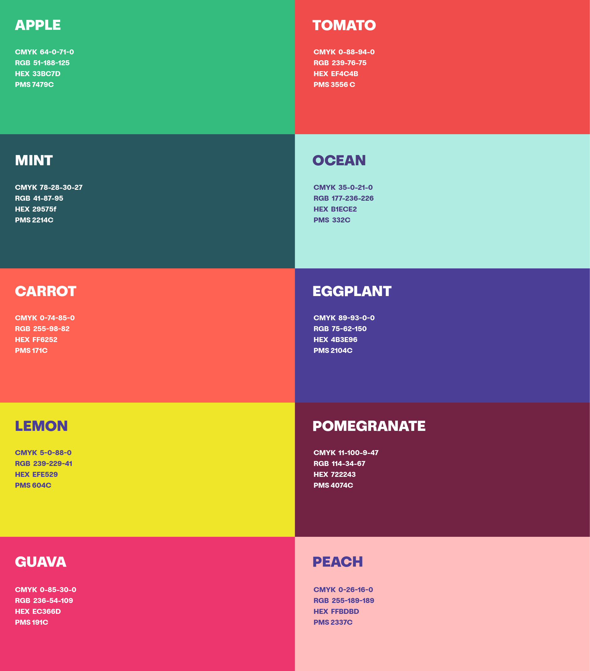
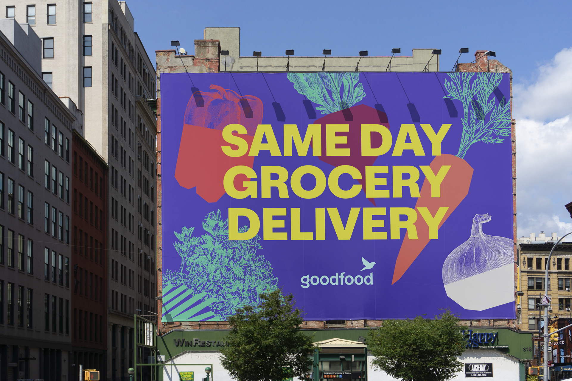
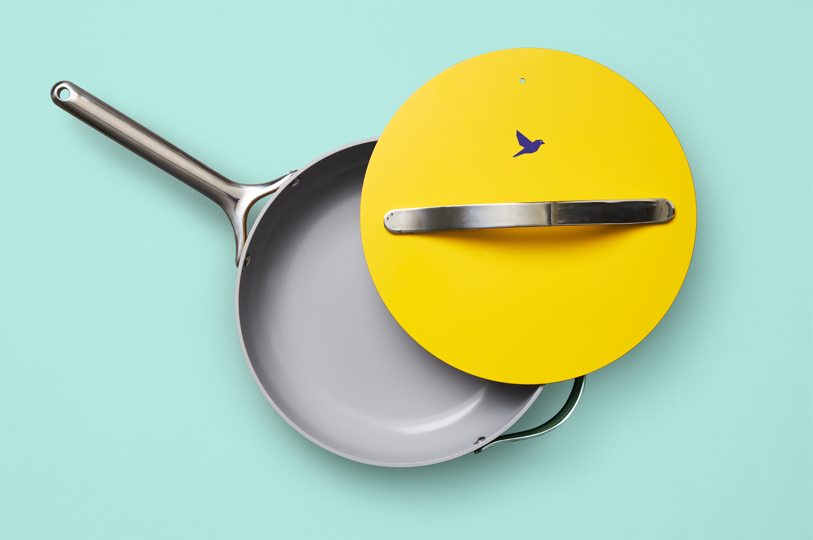
Quake brought this mission to life with a brand language as colourful as their food. The result is a fresh and distinctive brand that retains the existing equity and seamlessly integrates its digital and physical assets.
Credits
Design: Cody Sennyuen, Kevin Umana, Vy Vo
Creative Direction: Barry Quinn
Client: Goodfood
Agency: Quake
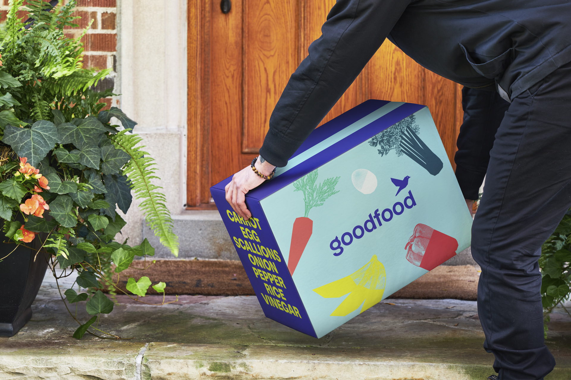


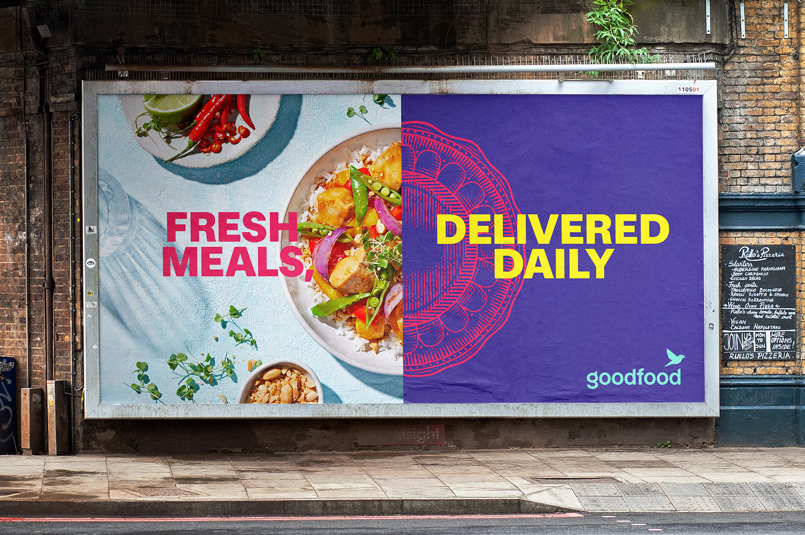
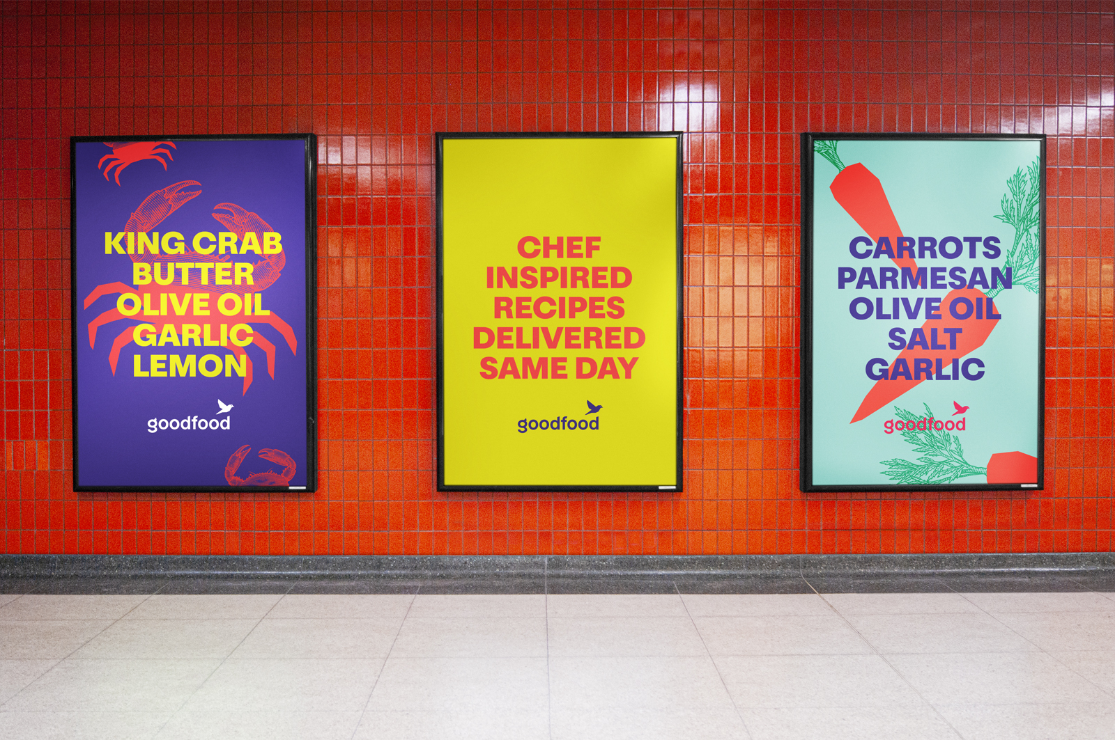
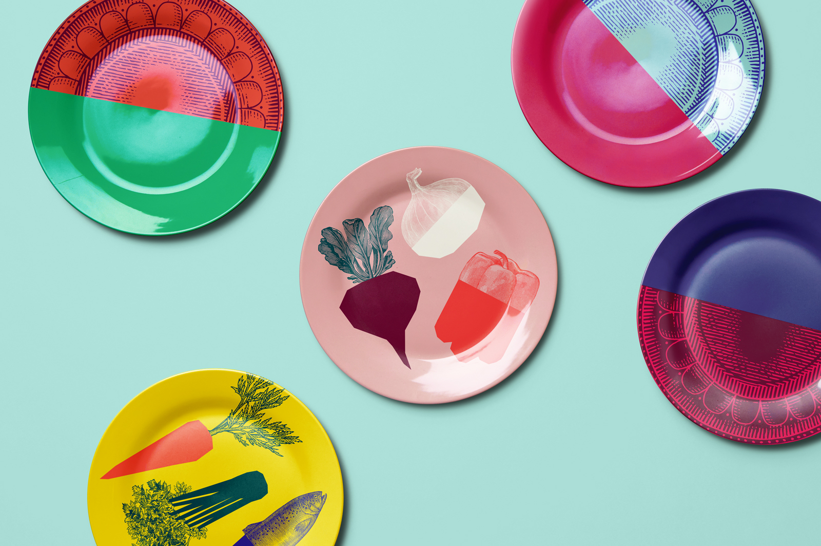
Food photography is vital to a meal delivery brand, but it does make it difficult to stand out. Quake created an illustration system that marries the tradition of botanical woodcuts with the bold character of vector art, creating tasty illustrations that are unlike any of our meal kit and delivery competitors.


Available for freelance
Let's talk at codysennyuen@gmail.com
© cjthedesigner 2024
Graphic designer